Thousands of decisions are involved in creating a website. Among the decisions are choices of format, images, color and type — just to name a few. Each design element works in conjunction with all the others to create an overall impression. Therefore, making wise choices is imperative for a professional site that achieves the desired result.
In this post, we will take a look at one element — typography — and the decisions that go into using it effectively. A post on creativebloq.com defines typography as: “the art of arranging type into a legible, aesthetically pleasing and design-appropriate layout.”
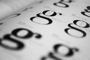
There is an array of typefaces available for use online — which can lead to a fabulous result or a disastrous one. Effective use of type begins with choosing the best typeface for a site and incorporates these three primary factors: style, readability and inclusiveness.
- Is the style a right fit? Type styles reflect personality traits – from traditional and conservative to progressive, creative and avant-garde, and everything in between. The best type style for a specific site is one that accurately reflects the character of the company, its brand and its product/industry.
- Is this typeface clear and legible in the sizes planned for its use? Readability is an essential consideration. To be effective, type must always be clear and legible. Not all typefaces are intended to appear on screen or at all sizes; some are best reserved for print applications. Before making a final decision on typeface, it is necessary to preview prospective fonts in a browser using the sizes and weights under consideration.
- Does this type style offer the complete character set needed for this site? Are bold and italicized font versions available? (If not, a browser will create ‘fake’ versions that will likely be less than ideal.) Are special characters and punctuation marks available in this type style in the languages used by the site? These are questions to ask when considering inclusiveness.
Once a typeface is chosen, it’s necessary to identify suitable properties (size, line height, line length, color and spacing/rhythm) by answering these questions.
- What is the optimal size of this typeface for readability? The answer to this question varies among styles and among common devices and screen sizes. Therefore the chosen typeface should be tested on several screens and a baseline font size established.
- What is the optimal line height for this typeface and size? Once again, readability is the basis for this decision of spacing between lines of type. A general rule is 1 1/2 times the size of the type, but that must be tested and adjusted accordingly with the one selected. Too little line height will appear crowded, and too much line height will result in a disjointed look.
- What is the optimal line length for this typeface and size? Lines of type that are too long or too short are distracting to the reader. A general rule for best readability here is about 80 characters. This provides a good starting point to be adjusted according to the specific needs of the typeface.
- In what color should the typeface appear? Color is one of the major decision areas beyond the scope of this post. However, to ensure readability of type, it is essential to choose colors that have adequate contrast with the background and the other elements on the page. Accent colors should be using sparingly for headlines or other specific elements designed to catch readers’ attention.
- What is the appropriate spacing and rhythm for this typeface? The spacing and rhythm of a page are created by suitable space between elements (headlines, paragraphs, images/graphics, etc.) and consistency in the font sizes and treatment of each element. Careful consideration to these properties will result in optimal readability and a polished, professional look.
Website Design: Final Typography Considerations
Once the questions above are answered, there are two considerations remaining for effectively executing typography choices.
Consistency: Using type sizes and styles inconsistently is a clear indication of an amateur site. Keep sizes, styles and colors of type elements (headlines, subheads, body text, etc.) uniform through the pages of a site, with very few or no deviations. Consistency is imperative for readability, coherence and professionalism.
Length: With no constraints in terms of length (as there are in print applications), it may be tempting to include extensive content on a page. Consider that web readers tend to scan rather than read word for word, so it is advisable to keep wording concise, using headings and bullet points to break content into sections. Detailed content can be archived with links provided for readers who want to investigate the topic further.
These questions and considerations are fundamental to an effective and professional website. As an article on Entrepreneur.com states, “a typographically well-formatted copy ensures that the focus remains on the content and not on the effort required to read it.”
Each day, the Page Progressive team determines effective typography solutions for our clients’ sites. We would be glad to put our expertise to work for you. Please contact us!