If you’re considering updating your website before the end of the year, now is the perfect time to start planning. But what’s the best way to maximize your online presence? A quick look at competitors’ websites will reveal a variety of design styles—but which layout best fits your needs while keeping your visitors’ attention? One increasingly popular approach is the split-screen design.
Why Attention Matters
We live in a fast-paced digital world where capturing and holding attention is harder than ever. A Microsoft study in 2015 revealed that the average attention span had dropped from 12 seconds in 2000 to just 8 seconds in 2013. More recently, research by CNN found that the average screen attention span is now only 47 seconds—a dramatic decline from 150 seconds in 2004.
With numbers like these, your website needs to hold a visitor’s focus long enough to guide them toward your call-to-action (CTA). But while you want to highlight who you are and what you offer, overwhelming visitors with too much information can backfire. The key is balance. That’s where split-screen design comes in.
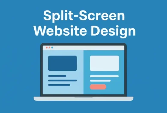
 What Is Split-Screen Design?

A split-screen layout uses two side-by-side panels to present content in a clean, impactful way. It allows designers to showcase multiple options or ideas without clutter. Here are a few common approaches:
-
Classic Split-Screen – Two symmetrical panels with distinct blocks of content.
-
Faux Split – A “fake” split used for aesthetics rather than functionality.
-
Layering Splits – Overlapping elements from one panel onto another for added depth.
-
Uneven Splits – Asymmetrical design that draws more attention to one side.
-
Vertical Split-Screen – The page is divided into two or more vertical sections, giving users a choice between different content flows.
Examples of websites using split-screen design include:
Among these styles, the vertical split-screen is often the most versatile and widely used.
When to Use Split-Screen Design
Split-screen layouts work especially well when:
-
You need to highlight two or more elements equally.
-
Your site requires multiple CTAs.
-
Visitors should choose between two paths right from the start (e.g., B2B vs. B2C options).
-
You want to show the relationship between different pieces of content.
It’s particularly effective for e-commerce, portfolios, landing pages, content platforms, and advocacy sites.
Benefits of Vertical Split-Screen Design
The vertical split-screen has several advantages:
-
Information Visibility – Display visuals alongside text, ensuring key details and CTAs are always in view.
-
Creative Expression – Despite its clean structure, it allows for bold colors, typography, and branding elements.
-
Unified Navigation – A single, simplified navigation menu keeps users oriented.
-
Visual Flow – Great for presenting distinct elements while still showing their connection.
-
Multiple Components – While often two panels, you can expand to three or more. On smaller screens, the layout stacks vertically to maintain logical flow and readability.
Final Thoughts
While the split-screen design isn’t ideal for every website, its versatility and modern aesthetic make it a valuable option for many. If you’re seeking a way to make your website more user-friendly while effectively showcasing a wide range of information, a split-screen layout is an excellent place to start.
Ready to see how a split-screen design could work for your website? Contact the team at Page Progressive today—we’d love to review your site and help determine the best design strategy to elevate your online presence.