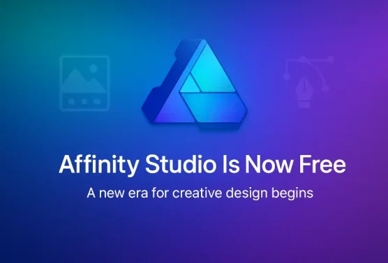
Big news in the world of design software — Affinity Studio has officially launched, marking a major milestone for the creative community. Even more exciting: all Affinity applications are now completely free for everyone to download and use.
This announcement follows the recent acquisition of Affinity by Canva, the online design platform known for making graphic creation accessible to everyone. Canva’s purchase of Affinity signaled big changes ahead, and this release confirms it — the powerful suite of professional-grade tools is now available at no cost.
Although mobile first is not a new concept, it has become much more important than perhaps anticipated. In fact, since July 1, 2019, Google has been using mobile first as its default for all new web domains. Based on its name, one can easily surmise that search engines will shift towards a website designed for a mobile device first, and standard website design next.
You want your business to grow. You have done all the things that are necessary to bring guests to your website – SEO, link bait, branding and more. And now that people are on your website, you want your guests to become your customers and clients. To do this, an effective call to action button is necessary. A successful call to action button prompts a user to take the next step, which results in conversions for a blog or website.
When it comes to designing a good website, I always think of the book "Don’t Make Me Think" by Steve Krug. It’s an oldie, but a "goodie." As a web developer, we are always faced with the battle between usability and aesthetics. Not to say that you can’t have both, but they are often at odds with one another. Throw in the need for a website to be search engine optimized and you get even more complexity. Here’s the thing to keep in mind: USABILITY SHOULD ALWAYS WIN.
Why, you may ask? Although it is critical for a website to be found on the internet, and the look of a website can leave a serious impression on a user, having a website that will get your visitors where you want them to go as quickly and easily as possible should be your goal when (re)designing a website. Take a look at a few very successful, yet very simple sites, Google and Craigslist. Both look like they were designed by a middle schooler in 1992, and yet, their simplicity is why they succeed. Both sites make it undeniably simple to do what you should be doing on them.
Sometimes we have to "coach" clients that insist that a website design must contain a 3D spinning logo, long Flash animation or absolutely zero text, but they also tell us that ranking on a search engine is critical to their business. Don’t get me wrong…all of those elements do have their place occasionally, but often the people asking for them don’t have a clear purpose in mind. So, we create what we call a "Predesign" for all of our clients that gives them a wire-frame look at how their site would be organized, based on the client’s initial feedback and the research that we have done in their industry. We use a tool called Basalmiq that makes it super simple to throw together a mock-up. While, it’s certainly not the most robust layout tool, and it’s interface is a bit clunky, it gets the job done quickly and it’s hand drawn look makes it very obvious to our clients that we are not tackling aesthetics with these mock-ups.
Think with Purpose
A website should be structured so that once you identify the 3 things that 75% of all of your visitors will be looking for, make those things very painfully obvious to get to. If you want your clients to fill out a contact form…ask them to do so on your home page, but don’t pop up a window that obstructs the view of the rest of the page that will really annoy someone just looking for your phone number. If you have a lot of information on your site, make a search box easy to find. If you have a really hot product, feature it on the home page. If you want to establish credibility, feature some testimonials or association links. But the critical thing to remember is every element on the home page (and every other page, for that matter) should have a specific purpose…and that purpose is 98% of the time NOT to entertain the visitor with a cool presentation. And don’t even think about using a "splash page" with just your logo on it that clicks through to your home page. That just introduces an extra layer of clicking to get to your site and almost begs them to go somewhere else because they won’t find what they are looking for here.
Of course, there are exceptions to these rules, but the main idea here is to think about WHY you are doing what you are doing with your website, and preferably do that before you get into the aesthetics of how it will look. It’s tempting to jump right into that, and we often get asked for proposals where we give an aesthetic look for a site….but without any data on who will be using the site, why they would be there and what services or products they need to sell, etc.
So the next time you are ready to update your site…think before you shell out the big bucks….or at least hire an expert to think for you. And TRUST them.
According to a recent poll done by Webcopyplus, the aethetics of a website design has a significant effect on how long users stay on your website. Almost 25% of web users indicated “poor visual presentation” as the number one element that drives them away from websites, up from 6.6% in 2007.
When users were asked what’s most likely to drive them away from a website they said:
50.9% indicated “slow load times”
24.8% noted “weak web copy”
24.2% specified “poor visual presentation”
This trend seems to indicate that as the web continues to mature, simply having a web site is not enough. To compete you must have a website that stands out from the rest and focuses on what you need your visitors to do, IE: sign up for your newsletter, buy a product, fill out a contact form, etc.
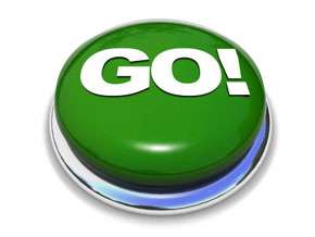
 You want your business to grow. You have done all the things that are necessary to bring guests to your website – SEO, link bait, branding and more. And now that people are on your website, you want your guests to become your customers and clients. To do this, an effective call to action button is necessary. A successful call to action button prompts a user to take the next step, which results in conversions for a blog or website.
