
 While it may seem preposterous that a school might not have a website, there are many schools that either don’t have a website or don’t have one that they can manage themselves to produce timely updates. If you find yourself tasked with updating a school website, or maybe you are creating one from scratch, then there are many elements to keep in mind. The details will vary from school to school, but knowing what it takes to design a school website that is both functional and user-friendly will result in a school website that appeals to teachers, students and guests.
-

School Website Design
-

7 Mobile Website Design Trends
If you have yet to upgrade your website to a being mobile-friendly, then you are missing a large number of opportunities for increasing your client base. Thanks to the explosion of mobile devices that allow one to surf the Web, it is imperative that businesses take advantage of a mobile website design. “But, what should a mobile website design look like?” you may ask. Here is a list of the top mobile design trends you should consider including as part of your mobile website design.
-

12 Reasons to Hire a Professional Web Developer for Custom Sites
If you have been considering a custom web design for your business, but have no idea where to start, then the best thing you can do is hire a professional web developer. This is because a professional custom web design can provide you with solid user interface, marketability, a mobile-friendly site, a website rich in keywords for your industry, a ghostwriter for your blog and many other tools to make your website and business stand out from the rest. Yes, you can opt for a cheap or even free site with the tools that are out there, but like many other things in life, you get what you pay for. -

User-friendly Call to Action Buttons for Your Website
You want your business to grow. You have done all the things that are necessary to bring guests to your website – SEO, link bait, branding and more. And now that people are on your website, you want your guests to become your customers and clients. To do this, an effective call to action button is necessary. A successful call to action button prompts a user to take the next step, which results in conversions for a blog or website. -

The Do’s and Don’ts of Landing Pages
 A very popular concept in the world of web design and internet marketing is the “Landing Page.” But what exactly is a landing page? While there is much discussion, there is not an exact definition. However, Dave Chaffey of SmartInsights defines landing pages as “Specific pages on a website created for visitors referred from marketing campaigns which are designed to achieve a marketing outcome.” Or, one could say a landing page is a place to get targeted online leads.
 -

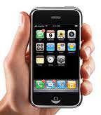
Website Usability: Designing for Mobile Devices
In the quest to make your website more user-friendly, there comes a time when you need to give great thought as to what type of device and user you are designing for. As mentioned in part 1 of this series, many people today are accessing the web via mobile and multi-touch devices. As Steve Jobs commented just days after the release of the iPad," Elements that rely only on mousemove, mouseover, and mouse out or as a CSS pseudo-class hover may not always behave as expected on a touch-screen device such as the iPad or the iPhone."1 As a result, web developers should keep in mind that anything designed for the web and requiring a hover state has an uncertain future and may face serious website usability issues. Not sure? Consider this telling fact, "There are two smartphones being purchased for every one desktop computer."2
 There are a variety of steps you can take to keep a website, whether
being viewed on a desktop or mobile screen, from being unpleasant at
best and unusable at worst. Here are a few common elements you may wish
to consider avoiding as you design or edit your next site.- Splash
pages that require an extra click to get into a site -If you must, make
sure there is a good reason for it. Not just to "Be cool." - Videos or music that plays automatically on load – Unless you
want to compel a large percentage of your visitors in public places to
scramble for the "Close Window" button. - Using drop down menus or
hiding content that is critical for people to get to easily – Although
the popularity of the drop down menu has helped to reduce it’s inherent
counterintuitiveness, consider other, more simple navigation techniques - Hyperlinks that are not totally obvious
- Javascript tool tips or other pop up boxes – Use these only for supplemental information, not critical info
- Build intentionally and specifically for the touch screen devices
Although
many of these items relate to Javascript, that doesn’t mean that one
should quit using it (It can be a very useful tool, actually), but
rather that it is necessary for web designers (and website owners) be
aware that every "special effect" should be there for a purpose. Whether
it is getting more content on the page for SEO reasons without making
the page look so text-heavy, or hiding a login area that comes to the
forefront only after a click, if only 20% of a site’s visitors may need
to login, etc.Website usability for the mobile generation also means some natural constraints3.
According to Luke Wroblewski, website usability for the mobile device
means that pages should be designed for a screen size of 480-320 pixels,
which is only 80% of the size of a low resolution desktop screen. As a
result, designers need to focus on what aspects of the site are most
important to your customers. You will also want to keep user interface
elements geared toward these "finger usable" sizes:- Use extra big buttons
- List components should have plenty of line spacing
- The width of a finger limits the density of items on the screen. If
the items are too close, the user will not be able to choose a specific
one.
With all of the browsers, devices, and programming
choices today, it’s easy to get caught up in implementing too many
features. However, ensuring website usability is a critical aspect of
increasing sales and that is the bottom of line for any business. After
all, the average user is not going to stay on a site that is difficult
to use, challenging to focus on, or takes too long to load. If you want
to increase your website’s usability, be sure to ponder these
suggestions. And remember that Page Progressive is happy to help you make your website all it can be 🙂Sources:
- http://trentwalton.com/2010/07/05/non-hover/
- (.net/standards, Sept. 2010)
- Practical Web Designs, Sept. 2010
- Splash
-

Website Usability: 7 Reasons Why It’s All About the User
As you begin examining your website to see if it is usable to your visitors, there are many aspects you will want to research. Not only do you want it simple yet informative, you want your visitors to recognize, among other things, that they are important to you. Recently, the U.S. Department of Health and Human Services, after much research and combined years of experience have released the following website accessibility guidelines to enhance a website’s usability.
 Website Usability Design Guidelines
- Provide content that is engaging, relevant and appropriate to the audience; this is the most critical aspect of the web page.
- Use all available resources to better understand the user’s requirements.
- Make sure the website’s format meets user expectations. It should
be easy to use, have helpful content and be well organized. This will
also encourage others to want to use your site. Also keep in mind the
guidelines for Section 508 standards for being friendly for those that are visually impaired. - Focus first on the users; get them involved to better meet their
requirements. Some websites are better at this than others. Remember,
just because your company personnel does not have trouble using your site
doesn’t mean that your customers will experience the same thing. - State and set goals; recognize and determine the goals of the site
before beginning the design process; be clear and concrete. As King
Solomon said in Proverbs, "Where there is no vision, the people perish." - Consider the numerous interface issues during the design process. These issues include:
- Context within which users will be visiting
- Experience levels of the users
- Types of task users will be doing
- Types of computer and connection speeds
- Evaluation of prototypes
- Results of usability test
- Implement good SEO practices so that
your site will be listed in the top 30. Studies show that users do not
look at web pages that are not in the Search Engine’s top 30 results.
If, upon reading these guidelines, you realize that your website needs
work, don’t despair. According to a recent Public Accounts Committee
report, one-third of government sites did not comply with its own
accessibility guidelines. Of course, this doesn’t make having a website
that is difficult to use acceptable, but it does show that even with the
best of intentions, there are many websites that need more work. If you
recognize that your own website needs an overhaul, keep these tips (and
those in the upcoming posts) in mind as you consider how best to revamp
or contact Page Progressive and allow us to improve your website’s usability! -

4 Ways “Less is More” Regarding User-Friendly Websites
In a day when technology is constantly changing and improving, building a unique website has become more than choosing a WordPress template and plopping in your content. After all, there’s Flash, Javascript, a rainbow of color choices, gradients, boxes, bars, animated GIFs, widgets, gadgets, thingamajigs and many other programming and design elements to choose from, right? But does a website really need all of these "latest and greatest" web elements in order to be effective and usable? Many website developers and interface design experts agree the answer is a resounding "No." In fact, the wealth of possible website effects and features has lead to the detriment of many a website, when it comes to being user-friendly. And shouldn’t that be one of, if not the goal in any design?
 Set Limits, Guided by Goals
One paramount way to increase website usability is in setting goals and limits. All websites should be built with a few goals in mind. Those goals may be actions that you want to encourage your users to perform on your site, like sign up for your mailing list or it could be to sell as many of a particular hot product as possible. If you don’t have any goals, your website will lack structure and purpose and more than likely not give you the best results. There are several ways you
can actually improve you website by setting limits:Limit the Color
Just because there’s a color wheel to choose from doesn’t mean every
shade of green has to be used. Bill at GoMediaZine states, "Reducing the
number of colors we use in our design will make the piece feel
consistent. Keep the color palette small but vibrant." (Examples: Nike,
sports teams, chain restaurants)Limiting Typography
Like colors, keeping a consistent font is easier for the eye to
follow. A fancy font may work well for headings, but body text should be a
standard font that is easily read – even at small sizes. However, do keep
in mind that the over-use of a single font within a single design can
also be confusing and difficult to read. Often a layout can combine the use of 2 fonts to emphasize the different between a heading and the body text.Limiting Size
Website usability also means keeping the size of a magazine spread in
mind when designing your site. In fact, according
to web entrepreneur, Luke Wroblewski, websites and web applications
should be designed for mobile devices first, rather than the more common
order of designing first for the desktop. He supports this argument
citing that mobile use is growing rapidly. Designing for mobile devices
forces you to focus. Of course, page size is one of the many factors that has no hard set rule. In the planning stage, this should be one of the factors considered. For example, will your site be accessed more by people who have older computers with smaller screens? Will a mobile version of your site be necessary? Will people on iPads or other tablet devices make up a large number of your visitors?Minimize, not Maximize
Rather than using a little bit of every cool idea you’ve ever seen on a website,
you should use a few things really well. Products like the iPod or iPad
are remarkable not for all the options they have, but rather for what
they don’t have. Instead of having a dozen buttons like many other devices, these products have 4
buttons, making them easy to use and some of the most popular portable devices of all time.Simply put, much of the
features that improve website usability can be filed under the old
acronym K.I.S.S. Keeping it simple can go a long way to making visitors feel comfortable and eager to spend time there. And, that is
the point, isn’t it?


 If you have been considering a custom web design for your business, but have no idea where to start, then the best thing you can do is hire a
 You want your business to grow. You have done all the things that are necessary to bring guests to your website – SEO, link bait, branding and more. And now that people are on your website, you want your guests to become your customers and clients. To do this, an effective call to action button is necessary. A successful call to action button prompts a user to take the next step, which results in conversions for a blog or website.
 A very popular concept in the world of
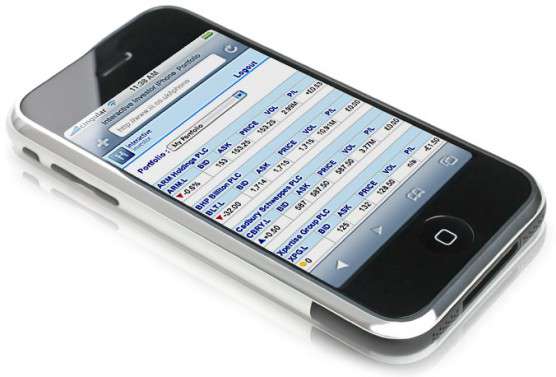
 There are a variety of steps you can take to keep a website, whether

 Set Limits, Guided by Goals